Charts
The Charts tab displays any logged numerical series, that is FloatSeries attributes.
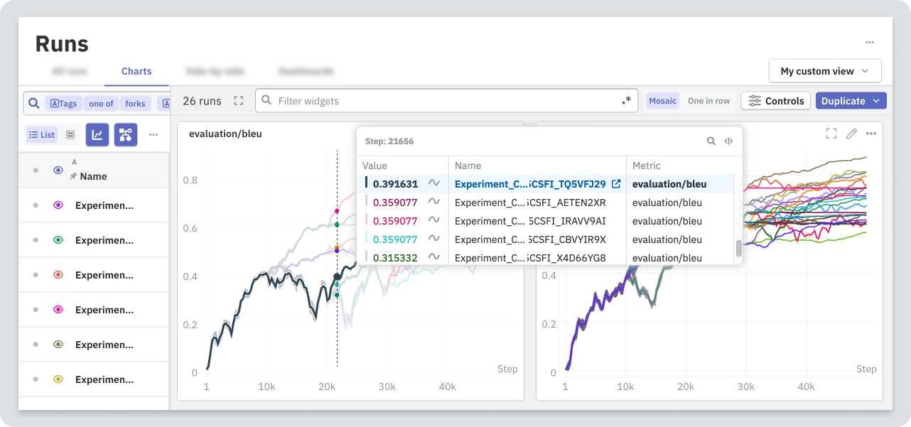
You can view multiple charts at once, or maximize the space of a single chart for deeper analysis. A customizable legend helps analyze runs without leaving the tab.
How to log a numerical series?
from neptune_scale import Run

run = Run()

for step in epoch:
    # your training loop
    run.log_metrics(
        data={"loss": 0.14},
        step=step,
    )
To log several metrics at once, pass multiple key-value pairs:
run.log_metrics(
    data={"loss": 0.14, "acc": 0.78},
    step=step,
)
Changing chart settings
The Charts tab displays a separate chart for each metric that's logged to the currently visualized runs.
To display multiple metrics in a single chart or apply custom expressions, use chart widgets in dashboards and reports. For details, see Configure a chart widget.
Edit a single chart
To change the chart settings, open the widget menu (). You can modify the following:
- Apply smoothing
- Change axis settings
- Change X-axis values
Edit charts globally
You can configure settings that apply to all charts displayed in the Charts tab. Use Controls in the top toolbar to modify the following:
- Apply smoothing
- Change axis settings
- Change X-axis values
- Filter displayed data based on step
For details, see Global controls.
Save changes
Changes made in the Charts tab are stored by your browser. To let other users see your changes, export the modified charts to a dashboard or report.
Showing inherited metrics
When viewing runs that aren't experiment heads, use the Show inherited metrics toggle to display metrics only from the run itself or also from ancestor runs.

When viewing experiment heads, the history from all runs within the experiment is plotted regardless of the toggle.
Zooming the chart
To zoom in, click and drag over an area of the chart.
To reset the zoom, double click anywhere on the chart.
Filtering charts
To filter charts by attribute name, use the search. Regular expressions are supported.
Selecting runs to compare
To plot runs on charts, in the left table pane, click the eye icons ().
To access display shortcuts, click the eye icon () on the header row.
You can plot a maximum of 1000 graphs on a single chart. For example, if you're displaying 20 metrics from each run, you can select a maximum of 50 runs to compare.
Comparing grouped runs
While showing runs in Group mode in the All runs tab, you can represent each group as a single line.
To compare grouped runs:
- Switch to the Charts tab.
- Open Controls → Grouped and inherited metrics.
- Toggle Average grouped runs.

Exporting charts
You can export the displayed charts to a new or existing dashboard or report:
- Dashboard saves the set of charts as a template that you can apply to any visible runs.
- Report saves the set of charts, including which runs are visible.
The result snapshots the attribute names that match the search query at the time of exporting the charts. If new metrics appear that also match this query, a dashboard or report doesn't update to include them. For charts to update dynamically, you must update the widget settings. For details, see Select metrics dynamically.
Export all charts
To export all displayed charts:
- From the toolbar, select Duplicate.
- From the dropdown, choose an export option.
Export selected charts
To export only selected charts:
-
Check the boxes on the widgets that you want to export.
-
In the toolbar that appears, choose an export option from Duplicate selected.
To verify the widgets that you're about to export, expand the toolbar.